#TidyTuesday - Plastic Pollution

The Data
Tidy Tuesday provides the following code to load in the data:
# Get the Data

# Read in with tidytuesdayR package
# Install from CRAN via: install.packages("tidytuesdayR")
# This loads the readme and all the datasets for the week of interest

# Either ISO-8601 date or year/week works!

tuesdata <- tidytuesdayR::tt_load('2021-01-26')
tuesdata <- tidytuesdayR::tt_load(2021, week = 5)

plastics <- tuesdata$plastics

# Or read in the data manually

plastics <- readr::read_csv('https://raw.githubusercontent.com/rfordatascience/tidytuesday/master/data/2021/2021-01-26/plastics.csv')
Since there are a few options, I decided to use the tidytuesdayR package option. That way, I can work with any other Tidy Tuesday data without having to find the link. I just need to know the week number.
#tuesdata <- tidytuesdayR::tt_load(2021, week = 5) #load in this week's datatuesdata is a list where the first item is our dataframe, so we’ll need to extract the plastics item from the list and save it.
#plastics <- tuesdata$plastics #grab the plastics item from the list and save it as plastics (this is our data)Note: I ended up having to use the other option sometimes when I had too many github requests
plastics <- readr::read_csv('https://raw.githubusercontent.com/rfordatascience/tidytuesday/master/data/2021/2021-01-26/plastics.csv')## Parsed with column specification:
## cols(
## country = col_character(),
## year = col_double(),
## parent_company = col_character(),
## empty = col_double(),
## hdpe = col_double(),
## ldpe = col_double(),
## o = col_double(),
## pet = col_double(),
## pp = col_double(),
## ps = col_double(),
## pvc = col_double(),
## grand_total = col_double(),
## num_events = col_double(),
## volunteers = col_double()
## )If we peek at the data, it looks like each row is a country-year-parent_company combination. This data only contains 2019 and 2020.
plastics %>% head() %>% knitr::kable()| country | year | parent_company | empty | hdpe | ldpe | o | pet | pp | ps | pvc | grand_total | num_events | volunteers |
|---|---|---|---|---|---|---|---|---|---|---|---|---|---|
| Argentina | 2019 | Grand Total | 0 | 215 | 55 | 607 | 1376 | 281 | 116 | 18 | 2668 | 4 | 243 |
| Argentina | 2019 | Unbranded | 0 | 155 | 50 | 532 | 848 | 122 | 114 | 17 | 1838 | 4 | 243 |
| Argentina | 2019 | The Coca-Cola Company | 0 | 0 | 0 | 0 | 222 | 35 | 0 | 0 | 257 | 4 | 243 |
| Argentina | 2019 | Secco | 0 | 0 | 0 | 0 | 39 | 4 | 0 | 0 | 43 | 4 | 243 |
| Argentina | 2019 | Doble Cola | 0 | 0 | 0 | 0 | 38 | 0 | 0 | 0 | 38 | 4 | 243 |
| Argentina | 2019 | Pritty | 0 | 0 | 0 | 0 | 22 | 7 | 0 | 0 | 29 | 4 | 243 |
Tidy Tuesday also provides a Data Dictionary that explains each column in the dataset:
Data Dictionary
The plastic is categorized by recycling codes.
plastics.csv
| variable | class | description |
|---|---|---|
| country | character | Country of cleanup |
| year | double | Year (2019 or 2020) |
| parent_company | character | Source of plastic |
| empty | double | Category left empty count |
| hdpe | double | High density polyethylene count (Plastic milk containers, plastic bags, bottle caps, trash cans, oil cans, plastic lumber, toolboxes, supplement containers) |
| ldpe | double | Low density polyethylene count (Plastic bags, Ziploc bags, buckets, squeeze bottles, plastic tubes, chopping boards) |
| o | double | Category marked other count |
| pet | double | Polyester plastic count (Polyester fibers, soft drink bottles, food containers (also see plastic bottles) |
| pp | double | Polypropylene count (Flower pots, bumpers, car interior trim, industrial fibers, carry-out beverage cups, microwavable food containers, DVD keep cases) |
| ps | double | Polystyrene count (Toys, video cassettes, ashtrays, trunks, beverage/food coolers, beer cups, wine and champagne cups, carry-out food containers, Styrofoam) |
| pvc | double | PVC plastic count (Window frames, bottles for chemicals, flooring, plumbing pipes) |
| grand_total | double | Grand total count (all types of plastic) |
| num_events | double | Number of counting events |
| volunteers | double | Number of volunteers |
Data Summary
We can use skimr::skim() to see a summary of the data, including the number of rows and columns, column types, and some summary stats for each column.
skimr::skim(plastics) #print a summary of the data| Name | plastics |
| Number of rows | 13380 |
| Number of columns | 14 |
| _______________________ | |
| Column type frequency: | |
| character | 2 |
| numeric | 12 |
| ________________________ | |
| Group variables | None |
Variable type: character
| skim_variable | n_missing | complete_rate | min | max | empty | n_unique | whitespace |
|---|---|---|---|---|---|---|---|
| country | 0 | 1 | 4 | 50 | 0 | 69 | 0 |
| parent_company | 0 | 1 | 1 | 84 | 0 | 10823 | 0 |
Variable type: numeric
| skim_variable | n_missing | complete_rate | mean | sd | p0 | p25 | p50 | p75 | p100 | hist |
|---|---|---|---|---|---|---|---|---|---|---|
| year | 0 | 1.00 | 2019.31 | 0.46 | 2019 | 2019 | 2019 | 2020 | 2020 | ▇▁▁▁▃ |
| empty | 3243 | 0.76 | 0.41 | 22.59 | 0 | 0 | 0 | 0 | 2208 | ▇▁▁▁▁ |
| hdpe | 1646 | 0.88 | 3.05 | 66.12 | 0 | 0 | 0 | 0 | 3728 | ▇▁▁▁▁ |
| ldpe | 2077 | 0.84 | 10.32 | 194.64 | 0 | 0 | 0 | 0 | 11700 | ▇▁▁▁▁ |
| o | 267 | 0.98 | 49.61 | 1601.99 | 0 | 0 | 0 | 2 | 120646 | ▇▁▁▁▁ |
| pet | 214 | 0.98 | 20.94 | 428.16 | 0 | 0 | 0 | 0 | 36226 | ▇▁▁▁▁ |
| pp | 1496 | 0.89 | 8.22 | 141.81 | 0 | 0 | 0 | 0 | 6046 | ▇▁▁▁▁ |
| ps | 1972 | 0.85 | 1.86 | 39.74 | 0 | 0 | 0 | 0 | 2101 | ▇▁▁▁▁ |
| pvc | 4328 | 0.68 | 0.35 | 7.89 | 0 | 0 | 0 | 0 | 622 | ▇▁▁▁▁ |
| grand_total | 14 | 1.00 | 90.15 | 1873.68 | 0 | 1 | 1 | 6 | 120646 | ▇▁▁▁▁ |
| num_events | 0 | 1.00 | 33.37 | 44.71 | 1 | 4 | 15 | 42 | 145 | ▇▃▁▁▂ |
| volunteers | 107 | 0.99 | 1117.65 | 1812.40 | 1 | 114 | 400 | 1416 | 31318 | ▇▁▁▁▁ |
Data Wrangling
The first step I’d like to take is renaming the columns using the information in the data dictionary. This will help me to remember what each column means.
plastics_new <- plastics %>%
  rename("empty_count" = "empty",
         "high_density_polyethylene_count" = "hdpe",
         "low_density_polyethylene_count" = "ldpe",
         "other_count" = "o",
         "polyester_plastic_count" = "pet",
         "polypropylene_count" = "pp",
         "polystyrene_count" = "ps",
         "pvc_plastic_count" = "pvc",
         "total_plastic_count" = "grand_total", #I'm renaming this because there is also a country called "Grand Total" and I don't want to mix them up
         "times_counted" = "num_events")

  # #rename some values that are the same but have diff names
  # mutate(parent_company = gsub("estle", "estlé", parent_company),
  #        parent_company = gsub("PT Mayora Indah Tbk", "Mayora Indah", parent_company),
  #        parent_company = gsub("Pepsico", "PepsiCo", parent_company))
Viz
I’m interested in which parent companies create the most plastic pollution. Here is the code for my final plot:
#I want to look at the top 10 `parent_company`s with the highest total `total_plastic_count` (of all countries and years)

#Create new dataframe to use for my plot
p_dat <- plastics_new %>%

  #Get total `total_plastic_count` for each company
  group_by(parent_company) %>%
  summarise(total_plastic_count = sum(total_plastic_count)) %>%

  #Remove any parent_company where the name isn't actually 1 company
  filter(!parent_company %in% c("null","NULL","Grand Total","Unbranded", "Assorted")) %>%

  #Keep the rows with the top 10 total_plastic_count values
  slice_max(order_by = total_plastic_count, n = 10) %>%

  #Turn all " " and "-" into "\n" to fit more on one line
  mutate(parent_company = gsub("Tamil Nadu Co-operative Milk Producers' Federation Ltd", "Tamil Nadu Co-operative \nMilk Producers' Federation Ltd", parent_company))


#Create my plot
p <- p_dat %>%
  ggplot() +

  #Add a point for each company's count
  geom_point(aes(y = reorder(parent_company, total_plastic_count),
                 x = total_plastic_count,
                 col = parent_company),
                size = 15) +

  #Add a line for each company (lollipop chart)
  geom_segment(aes(y = parent_company,
                   yend = parent_company,
                   x = 0,
                   xend = total_plastic_count,
                   col = parent_company),
                  size = 2) +

  geom_text(aes(y = reorder(parent_company, total_plastic_count),
                x = total_plastic_count,
                label = total_plastic_count),
            size = 4,
            col = "white",
            fontface = "bold") +

  #scale the y-axis on a log scale so the values aren't as spread out
  # scale_y_continuous(trans='log10',
  #                    breaks = scales::trans_breaks("log10", function(x) 10^x),
  #                    labels = scales::trans_format("log2",
  #                                                  scales::math_format(10^.x))) +

  #Add all my labels
  labs(title = "Top 10 Creators of Plastic Pollutions Worldwide",
       subtitle = "Out of all cleanup events in 2019 and 2020, these 10 companies had the most plastic items that were made by the company.",
       caption = "Data from breakfreefromplastic.org | Viz by Aubrey Shuga",
       y = "Company",
       x = "Number of Plastic Items Found") +

  #All theme elements
  theme(legend.position ="none",
        panel.background = element_blank(), #remove gray background
        axis.text.y = element_text(face = "bold", size = 10), #no y-axis tick labels
        axis.ticks.y = element_blank(), #no y-axis tick marks
        axis.ticks.x = element_blank()) #no x-axis tick marks
p


#save each plot iteration so I can create a gif at the end
ggsave(plot = p, filename = file.path("iterations", paste0(Sys.time(),".png"))) 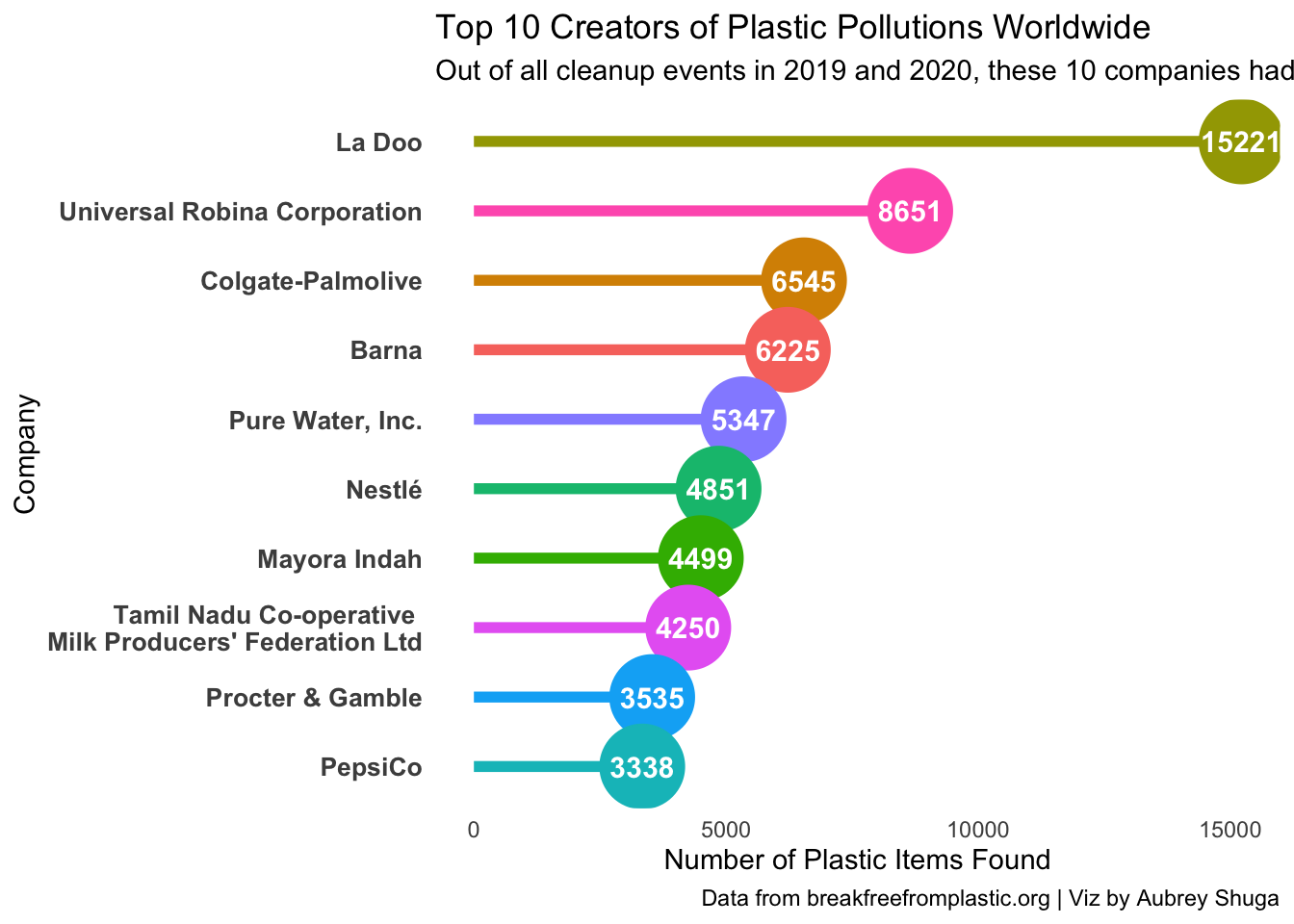
Gif
While creating my viz for this week, I saved a copy of each iteration. I now want to create a gif to show how my plot chnaged from my initial stab at it to my final plot. some steps taken from this tutorial
library(magick)

## list file names in interations folder
imgs <- list.files("iterations", full.names = TRUE)

#For each filename in imgs, read the image and store it in img_list
img_list <- lapply(imgs, image_read)

## join the images together
img_joined <- image_join(img_list)

## animate at 2 frames per second
img_animated <- image_animate(img_joined, fps = 4)

## view animated image
img_animated

## save to disk
image_write(image = img_animated,
            path = "plastic_pollution.gif")
You can see that I wanted to add more, but I ended up giving up and going back to an earlier iteration.