Tidy t-Tests using tidymodels
I recently discovered tidymodels, which is “a collection of packages for modeling and machine learning using tidyverse principles”. I love using the tidyverse, so I was really excited to jump in and get started with tidymodels. The infer package built into tidymodels includes functions for statistical inference, which is perfect for the work I’m doing as part of my senior project. In this post, I’ll work through my process using library(infer) to perform various t-Tests on my data. More background information on this project can be found here.
library(tidyverse)
library(tidymodels)
library(pander)
Data
This analysis focuses only on Tier 3 students, so Referral students were removed from the data. Note: For privacy reasons, the data used in these blog posts is not real data from real students. It is simulated data based on the real dataset from my project. However, it includes the same imperfections and other issues that I ran into while working with the real data.
## Source the scripts that contain the code from earlier posts
source("wrangling.R")
source("colors.R")

## Remove any students who aren't Tier 3
Students_wide <- Students_wide %>%
  filter(Student_Type == "Tier 3")

Mentored <- Mentored %>%
  filter(`Student Type` == "Tier 3")

Control <- Control %>%
  filter(`Student Type` == "Tier 3")

Students <- Students %>%
  filter(`Student_Type` == "Tier 3")

## Source the raincloudplots script now with only the Tier 3 students
source("raincloudplots.R")
Paired Samples t-Test
For each group, we want to answer the question “Is there an increase from Pre GPA to Post GPA for the average Tier 3 student?”. Because we have both pre and post measurements for each student in our dataset, we can use a paired samples t-test with the following null and alternative hypotheses:
\[ H_0: \mu_{\text{Change in GPA}} = 0 \]
\[ H_a: \mu_{\text{Change in GPA}} > 0 \]
with a significance level of \(\alpha = 0.05\).
Our null hypothesis is that the mean change in GPA is 0 (in other words, the average Tier 3 student earned about the same GPA from their “pre” semester to their “post” semester).
The alternative hypothesis is that the mean change in GPA > 0 (in other words, the average Tier 3 student increased their GPA from pre to post).
We’ll run this test three times. First on all Tier 3 students, then on only the control group, then on only the mentored group.
All Tier 3 Students
The chart below shows the Pre and Post GPAs of all Tier 3 students in the dataset. The gray lines connects the two GPAs for each student.
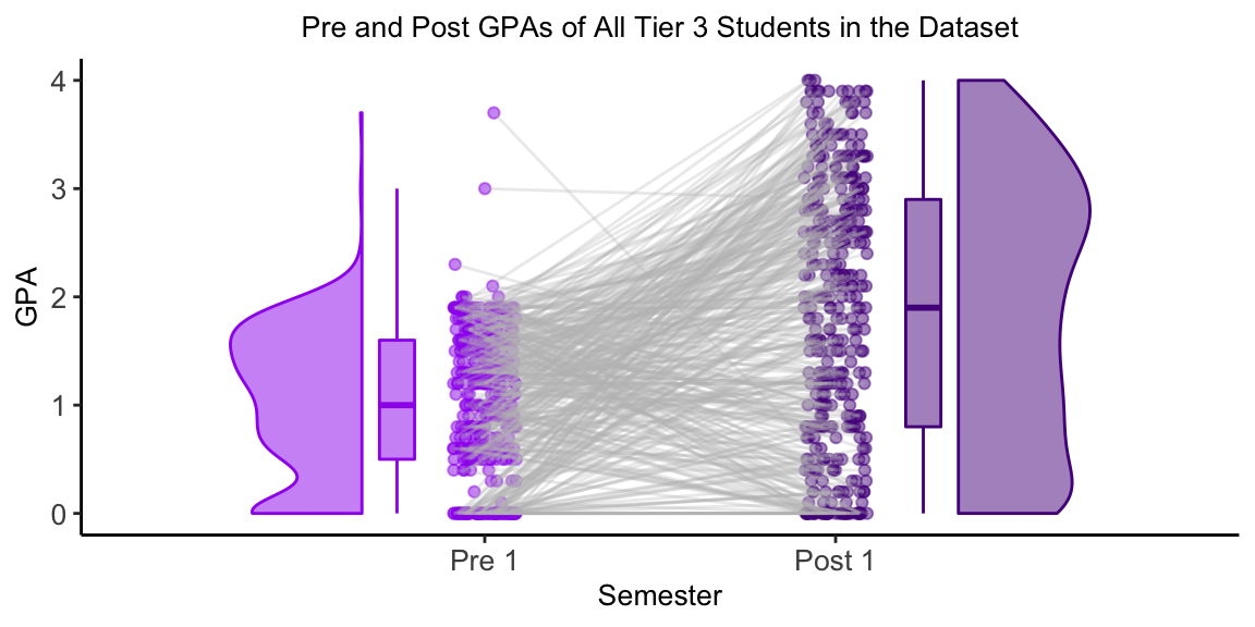
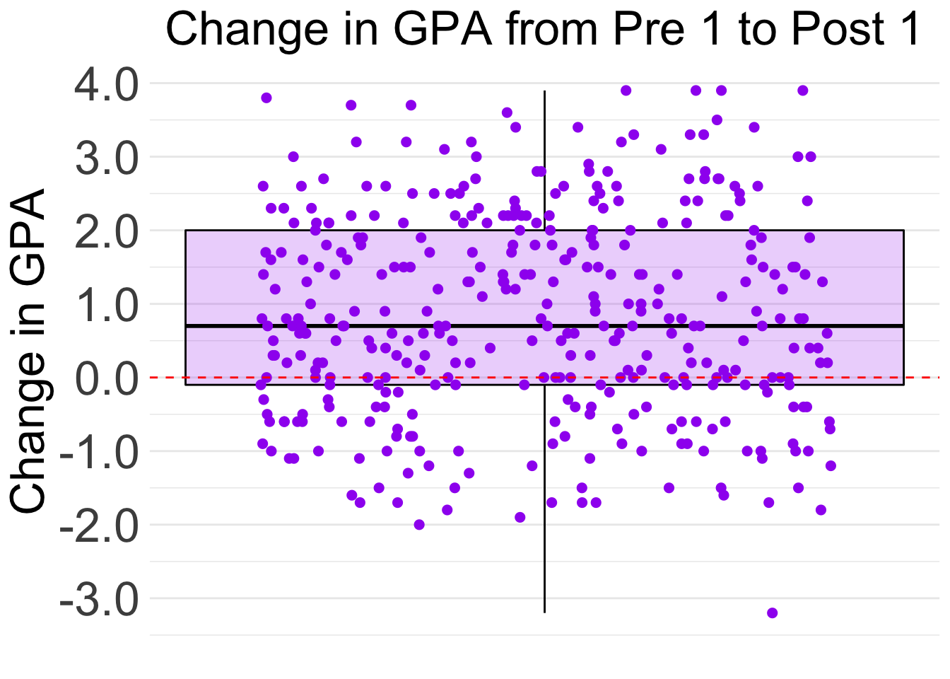
The boxplot shows that most of the students in the dataset improved their GPAs from Pre 1 to Post 1. Specifically, 25% of the students showed large improvement of +2 points or more. 25% of students’ improvement was between +0.8 points and +2 points. 25% of the students had minimal change in GPA, between +0.8 points and -0.1 points. The last 25% of students showed a decrease in GPA from the Pre 1 semester to the Post 2 semester.
We now want to run a t-test to answer the question, “Is there an increase from Pre GPA to Post GPA for the average Tier 3 student?”. The infer workflow includes four main functions: specify(), hypothesize(), generate(), and calculate() - as well as a variety of wrapper functions that perform specific hypothesis tests. While the wrapper functions are quicker and easier to use, the four workflow functions helped to remind me of everything happening “behind the scenes” of the t-Test and helped me to better understand and interpret the results.
The functions are designed to be used all together, so steps 1-3 below are just to explore what these functions are doing and are not necessary to do on their own.
1. specify() the Response Variable
In this case, our response variable is Change. The specify() function returns a tibble of the specified variables as an “infer” class. For now, we’ll just view the output of specify() using head().
Students_wide %>%
  specify(response = Change) %>%
  head()
## Response: Change (numeric)
## # A tibble: 6 x 1
## Change
## <dbl>
## 1 0.6
## 2 -0.6
## 3 2.5
## 4 1.3
## 5 0.2
## 6 2.12. Declare the Null Hypothesis with hypothesize()
Our null and alternative hypotheses are \[ H_0: \mu_{\text{Change in GPA}} = 0 \]
\[ H_a: \mu_{\text{Change in GPA}} > 0 \]
Because we are looking at the mean of one variable, we will set null = "point" and mu = 0.
Students_wide %>%
  specify(response = Change) %>%
  hypothesize(null = "point", mu = 0) %>%
  head()
## Response: Change (numeric)
## Null Hypothesis: point
## # A tibble: 6 x 1
## Change
## <dbl>
## 1 0.6
## 2 -0.6
## 3 2.5
## 4 1.3
## 5 0.2
## 6 2.13. generate() the Null Distribution
Using a bootstrap sample, the generate() function returns a tibble that contains generated data that reflects the null hypothesis.
Students_wide %>%
  specify(response = Change) %>%
  hypothesize(null = "point", mu = 0) %>%
  generate(reps = 1000, type = "bootstrap") %>%
  head() %>%
pander()| replicate | Change |
|---|---|
| 1 | -1.16 |
| 1 | -0.9599 |
| 1 | 0.6401 |
| 1 | 0.2401 |
| 1 | -0.8599 |
| 1 | 0.9401 |
4. calculate() the Observed t-statistics and compare to Null Distribution
First, we’ll want to calculate our observed statistic:
observed_statistic <- Students_wide %>%
  specify(response = Change) %>%
  hypothesize(null = "point", mu = 0) %>%
  calculate(stat = "t")

observed_statistic %>% pander()| stat |
|---|
| 11.86 |
The observed statistic from our data is 11.83 We want to know how likely it would be to get a test stat this extreme if the null hypothesis was true. We can do this by calculating this t stat for the null distribution. We can also visualize this by using the visualize() and shade_p_value() functions.
Students_wide %>%
  specify(response = Change) %>%
  hypothesize(null = "point", mu = 0) %>%
  generate(reps = 1000, type = "bootstrap") %>%
  calculate(stat = "t") %>%

  visualize()  +
  shade_p_value(observed_statistic,
                direction = "greater")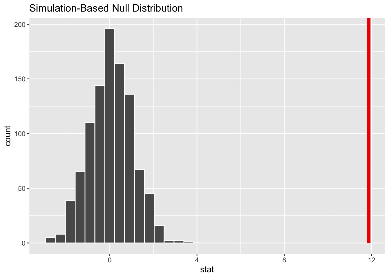
It looks like our observed stat would be very unlikely if the true mean GPA improvement was 0 points.
5. get_p_value() from the test statistic
Students_wide %>%
  specify(response = Change) %>%
  hypothesize(null = "point", mu = 0) %>%
  generate(reps = 1000, type = "bootstrap") %>%
  calculate(stat = "t") %>%
  get_p_value(obs_stat = observed_statistic,
              direction = "greater") %>%
pander()| p_value |
|---|
| 0 |
The p-value was very very small and rounded to 0. This means that the probability of seeing a test statistic as extreme or more extreme as our observed test statistic (11.86) is approximately 0, which which is below our significance level of 0.05. There is significant evidence to reject the null hypothesis in favor of our alternative hypothesis that the average student increased their semester GPA from Pre 1 to Post 1.
Wrapper Function t_test()
Another way to perform this t-test is the use the wrapper function provided in the infer package. This function is much quicker and simpler, but does not allow for quick visualization like the above workflow.
To use t_test(), we’ll pass in our response variable, mu = 0, and alternative = greater. It’ll perform the test in the background and return the test statistic, degrees of freedom, p_value, direction of alternative hypothesis, and a 95% confidence interval.
Students_wide %>%
  t_test(response = Change,
         mu = 0,
         alternative = "greater") %>%
pander()| statistic | t_df | p_value | alternative | lower_ci | upper_ci |
|---|---|---|---|---|---|
| 11.86 | 368 | 5.155e-28 | greater | 0.7404 | Inf |
We see the same results as before, along with the exact value for our p-value (5.155e-28) and our 95% confidence interval. It can be said with 95% confidence that a Tier 3 student would improve their GPA from Pre_1 to Post_1 by 0.74 points or more.
Control Group
Next, we want to run this same test on only the control group. I’ll use the wrapper function for this group.
The chart below shows the Pre and Post GPAs of the students in the Control group. The gray lines connects the two GPAs for each student.
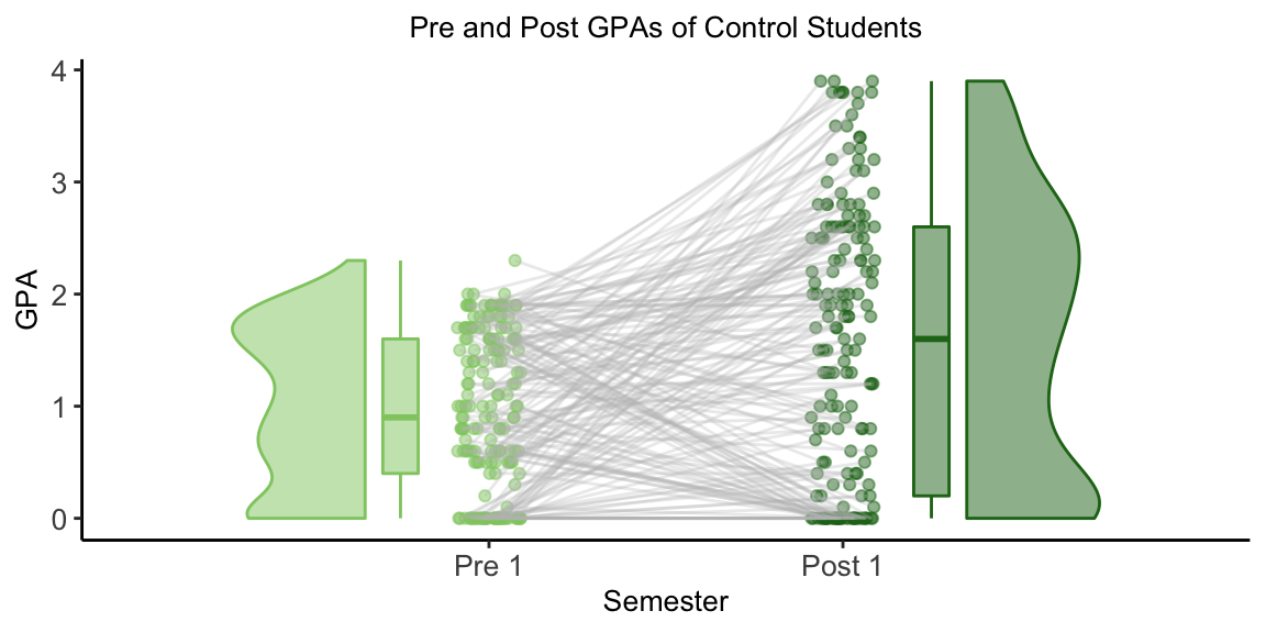
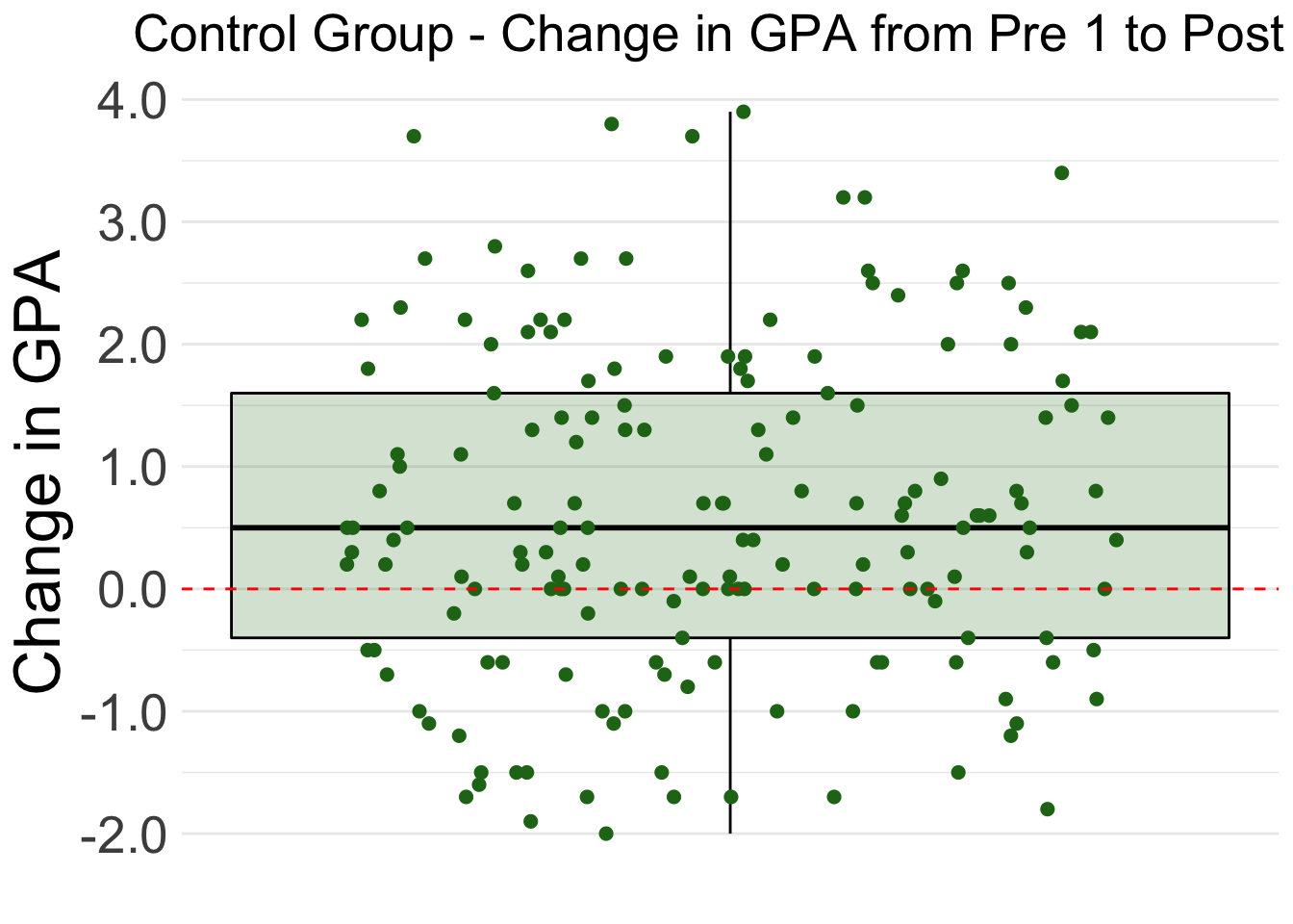
The boxplot shows that most of the control group improved their GPAs from Pre 1 to Post 1. Specifically, 25% of the students showed large improvement of +1.6 points or more. 25% of students’ improvement was between +0.5 points and +1.6 points. 25% of the students had minimal change in GPA, between +0.5 points and -0.4 points. The last 25% of students showed a decrease in GPA from the Pre 1 semester to the Post 2 semester.
Students_wide %>%
  filter(Group == "Control") %>%
  t_test(response = Change, mu = 0, alternative = "greater") %>%
pander()| statistic | t_df | p_value | alternative | lower_ci | upper_ci |
|---|---|---|---|---|---|
| 5.784 | 168 | 1.742e-08 | greater | 0.4284 | Inf |
A t-test on the data produces a p-value of 1.742e-08, which is below our significance level of 0.05. This means there is significant evidence to reject the null hypothesis in favor of our alternative hypothesis that the average Control group student increased their semester GPA from Pre 1 to Post 1. It can be said with 95% confidence that a Tier 3 student in the Control Group would improve their GPA from Pre_1 to Post_1 by 0.428 points or more.
Mentored Group
The chart below shows the Pre and Post GPAs of the students in the Mentored group. The gray lines connects the two GPAs for each student.
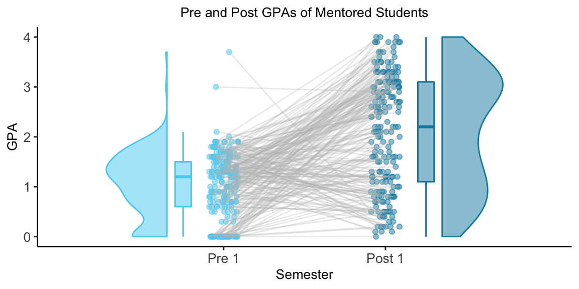
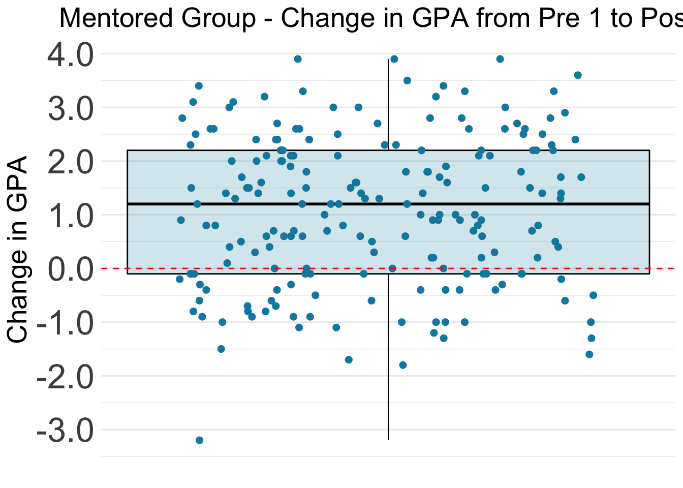
The boxplot shows that most of the Mentored group improved their GPAs from Pre 1 to Post 1. Specifically, 25% of the students showed very large improvement of +2.2 points or more. 25% of students’ improvement was between +1.2 points and +2.2 points. 25% of the students’ change was between +1.2 points and -0.1 points. The last 25% of students showed a decrease in GPA from the Pre 1 semester to the Post 2 semester.
Students_wide %>%
  filter(Group == "Mentored") %>%
  t_test(response = Change, mu = 0, alternative = "greater") %>%
pander()| statistic | t_df | p_value | alternative | lower_ci | upper_ci |
|---|---|---|---|---|---|
| 10.95 | 199 | 1.901e-22 | greater | 0.9166 | Inf |
A t-test on the data produces a p-value of 1.901e-22, which is below our significance level of 0.05. This means there is significant evidence to reject the null hypothesis in favor of our alternative hypothesis that the average Mentored student increased their semester GPA from Pre 1 to Post 1. It can be said with 95% confidence that a Tier 3 student in the Mentored Group would improve their GPA from Pre_1 to Post_1 by 0.917 points or more.
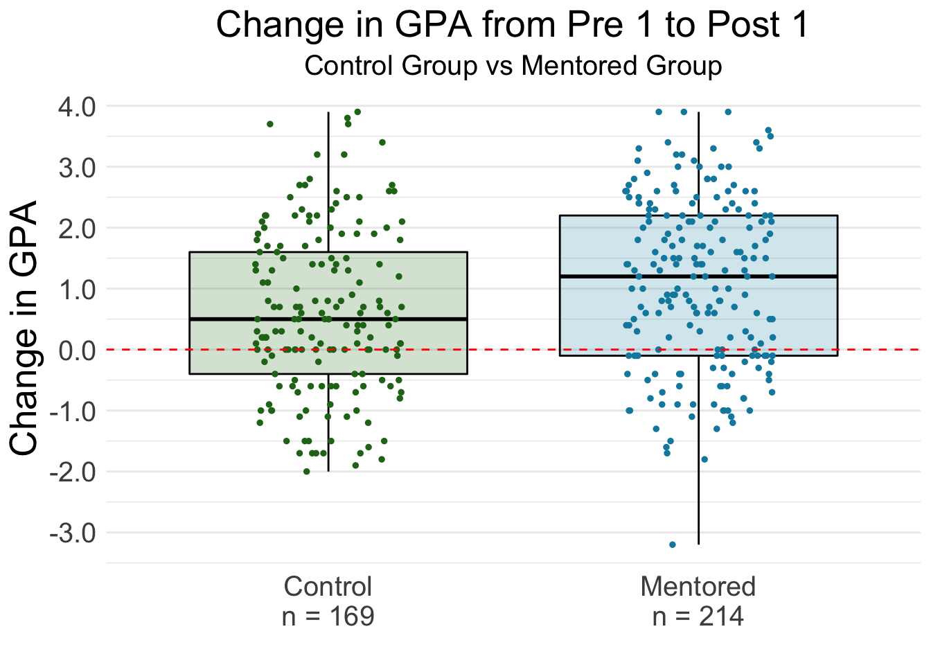
Independent Samples t-Test
Next, we want to answer the question “Do students in the Mentored group have a higher increase from Pre GPA to Post GPA than student in the control group?”
\[ H_0: \mu_{\text{Mentored}} - \mu_{\text{Control}} = 0 \]
\[ H_a: \mu_{\text{Mentored}} - \mu_{\text{Control}} > 0 \]
with a significance level of \(\alpha = 0.05\).
Our null hypothesis is that the mean change in GPA is the same for both Mentored and Control group students.
The alternative hypothesis is that the mean change in GPA is higher for Mentored students than Control Group students.
Again, there are two ways to do an independent t-Test using the infer framework.
Step by step
1. calculate() our observed statistic
We’ll need to specify our explanatory variable too, which is Group. We also want to provide an order to subtract the means in so that a positive difference means that Mentored students improve more than Control students.
observed_statistic <- Students_wide %>%
  specify(response = Change,
          explanatory = Group) %>%
  calculate(stat = "t",
            order = c("Mentored", "Control"))

observed_statistic %>% pander()| stat |
|---|
| 3.351 |
The observed statistic from our data is 3.539. We want to know how likely it would be to get a test stat this extreme if the null hypothesis was true and there was no relationship between what group a student is in and how much they improve. We can do this by generating the null distribution. We can also visualize this by using the visualize() and shade_p_value() functions.
2. generate() a null distribution
Because this is now an independent samples t-Test, we need to declare our new null hypothesis with hypothesize(null = "independence"). We also need to change the sample type to be type = "permute"
Students_wide %>%
  specify(response = Change,
          explanatory = Group) %>%
  hypothesize(null = "independence") %>%
  generate(reps = 1000, type = "permute") %>%
  calculate(stat = "t",
            order = c("Mentored", "Control")) %>%
  visualize()  +
  shade_p_value(observed_statistic,
                direction = "greater")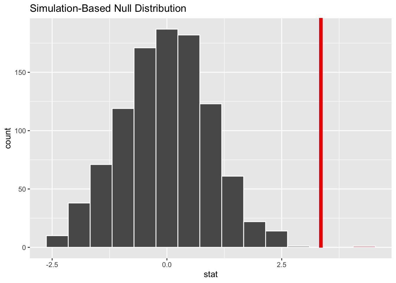
It looks like our observed stat would be very unlikely if the null hypothesis was true and there was no relationship between what group a student is in and how much they improve.
3. get_p_value() from the test statistic
Students_wide %>%
  specify(response = Change,
          explanatory = Group) %>%
  hypothesize(null = "independence") %>%
  generate(reps = 1000, type = "permute") %>%
  calculate(stat = "t",
            order = c("Mentored", "Control")) %>%
  get_p_value(obs_stat = observed_statistic,
              direction = "greater") %>%
pander()| p_value |
|---|
| 0 |
The p-value was very very small and rounded to 0. This means that the probability of seeing a test statistic as extreme or more extreme as our observed test statistic (3.351) is approximately 0, which which is below our significance level of 0.05. There is significant evidence to reject the null hypothesis in favor of our alternative hypothesis that the mean change in GPA is higher for Mentored students than Control Group students.
Wrapper Function t_test()
Again, we can perform this t-test using the wrapper function provided in the infer package.
Students_wide %>%
  t_test(response = Change,
         explanatory = Group,
         order = c("Mentored", "Control"),
         alternative = "greater") %>%
pander()| statistic | t_df | p_value | alternative | lower_ci | upper_ci |
|---|---|---|---|---|---|
| 3.351 | 360.3 | 0.0004457 | greater | 0.2435 | Inf |
We see the same results as before, along with the exact value for our p-value (0.0004457) and our 95% confidence interval. It can be said with 95% confidence that students in the Mentored group improve by at least 0.244 points more than the students in the Control group.
Further Study
A further analysis could be done comparing Referral Mentored students to Tier 3 Mentored students, as they might be impacted by mentoring differently. Additionally, the Mentored group used in this study includes students with various mentoring statuses, as marked at the end of their Tier 3 semester:
Fulfilled Program
Active Mentoring
Dropped
Referred to HJG/Skills Mentoring
These students all had a different mentoring experience, so it would be interesting to compare the outcomes between those different mentoring statuses rather than grouping them all together.
Sampling Method and Test Appropriateness
This data only includes Tier 3 students who meet the following criteria:
Attended and completed the semester they were placed* on Tier 3 (either Fall 2018 or Winter 2019)
Attended and completed at least one additional semester after their Tier 3 semester, within 2 semesters (Winter 2019 and/or Spring 2019)
*Placed on Tier 3 list at beginning of the semester due to their performance in their previous semester.
This sample of students may not be representative of all Tier 3 students. A more robust analysis could be done using a random sample of Tier 3 students that includes Mentored and Control students who skipped multiple semesters following their Tier 3 semester, or students who were off-track immediately following their Tier 3 semester and had not attended another semester by the time this data was collected.
Due to the nature of the sampling, a non-parametric test might be more appropriate for this data.