Exploring the raincloudplots Package
While working on my senior project , I’ve been struggling with the best way visualize to my data. I want to see individual datapoints as well as overall distribution. I started with boxplots and scatterplots, but I was really wanting something to show the ties between two sets of values.
Luckily, I stumbled upon this tweet by Micah Allen:
Exciting news 🌧️raincloud🌧️ fans! Raincloud plots 2.0 are here! Now with our most common feature request - a standalone R package! And STICKERS! https://t.co/TyxtW4GZ3l pic.twitter.com/S8tMl4QBSf
— Micah Allen (@micahgallen) January 22, 2021
This was exactly the type of visualization I was looking for! After reading through some of the documentation, I decided to take a stab at making some raincloud plots with my data!
The raincloudplots package can be downloaded from github using the following code:
if (!require(remotes)) {
  install.packages("remotes")
}
#remotes::install_github('jorvlan/raincloudplots')

library(raincloudplots)
The README.md includes a tutorial for using this package, which I followed at first and then attempted to replicate with my own data. I didn’t quite understand all of the functions and their parameters right away, but after some trial and error, I was able to figure out what goes where and get all my data in the right place. I also peeked inside some of the .R scripts for the different functions to try and understand a bit more about what’s happening under the hood.
After going through the tutorial twice (once with the example iris data and once with my own), I decided to grab my best plots (there were many throwaway attempts) and write up the process for each type of raincloud plot in the package. This helped me to collect my thoughts and clearly see the options I have to visualize my data.
Time to Make it Rain 🌧
Define Colors
First I want to define which colors will represent which groups. I have two groups: Mentored and Control. For each group, they have a GPA for 3 semesters: Pre 1, During, and Post 1. We’ll mostly be looking at Pre 1 and Post 1, so I would like to distinguish between those.
I decided to use #0B8AAD as the main color for the Mentored group and #21731B as the main color for the Control group. I also defined both group’s pre colors as a lighter shade of their group color. The during and post 1 colors will be the group’s main color.
#Define colors
mentored_col = '#0B8AAD'
control_col = "#21731B"

#Mentored Group Colors
m_pre = "#52D1F4"
m_during = '#0B8AAD'
m_post = '#0B8AAD'

#Control Group Colors
c_pre = "#90cb71"
c_during = "#21731B"
c_post = "#21731B"
Simulate Data
Before I apply this to the real student data for my project, I’d like to practice on some simulated data. I used rnorm() to generate some random GPA values with various means that are similar to my real data.
#Simulate data for each group
set.seed(1)
Mentored <- data.frame(Pre_1 = round(pmax(0, rnorm(100, mean=1.17, sd = .82)), 2),
                       During = round(pmin(4, pmax(0, rnorm(100, mean=2.6, sd = 1))), 2),
                       Post_1 = round(pmin(4, pmax(0, rnorm(100, mean=2.4, sd = 1))), 2),
                       Group = "Mentored")

Control <- data.frame(Pre_1 = round(pmax(0, rnorm(100, mean=1.07, sd = .78)), 2),
                      During = round(pmin(4, pmax(0, rnorm(100, mean=1.07, sd = 1))), 2),
                      Post_1 = round(pmin(4,pmax(0, rnorm(100, mean=1.07, sd = 1.28))), 2),
                      Group = "Control")
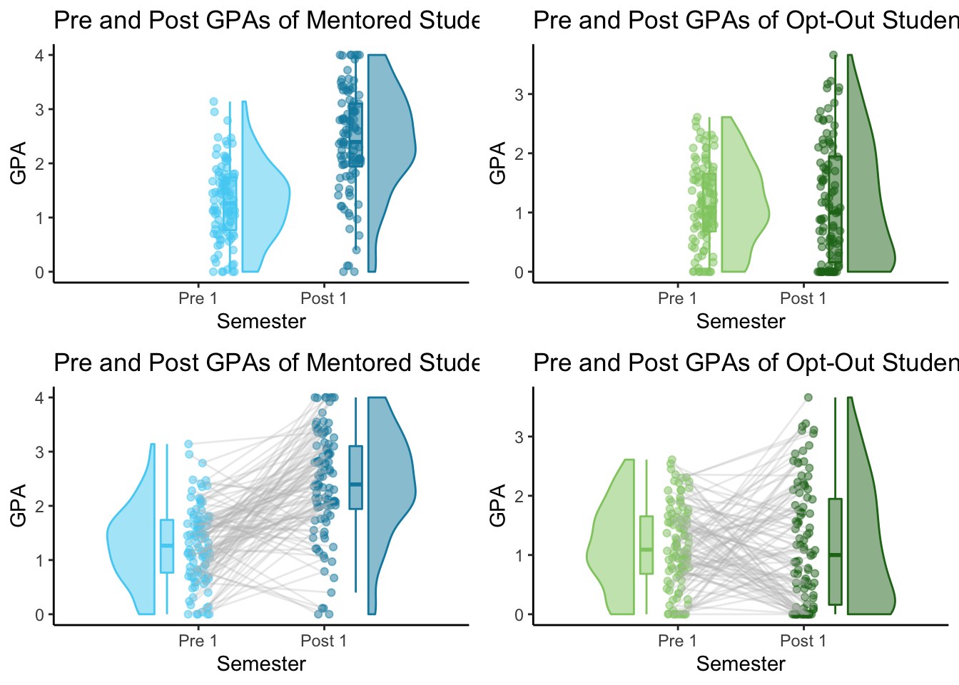
1x1 Raincloud Plots
There are a few different plotting functions in the raincloud package. I started by trying out the 1x1 plots (raincloud_1x1() and raincloud_1x1_repmes()) with the Mentored group.
The first step is to create a dataframe that works with the 1x1 plot functions. There is a function called data_1x1() that creates a dataframe with all of the correct columns.
To make a 1x1 dataframe for the Mentored Group, I needed to pick two sets of values to compare. Using Mentored$Pre_1 and Mentored$Post_1 will compare the student’s GPA’s from the semester before they participated in mentoring and the semester after they participate in mentoring.
# Create Mentored Pre-Post 1x1
Mentored_pre_post <- data_1x1(
  array_1 = Mentored$Pre_1, #first set of values
  array_2 = Mentored$Post_1, #second set of values
  jit_distance = .09,
  jit_seed = 321)
##   y_axis x_axis id       jit
## 1   0.66      1  1 1.0820609
## 2   1.32      1  2 1.0787114
## 3   0.48      1  3 0.9528797
## 4   2.48      1  4 0.9559133
## 5   1.44      1  5 0.9802922
## 6   0.50      1  6 0.9714124
##     y_axis x_axis  id      jit
## 195   4.00      2  95 2.046353
## 196   2.53      2  96 1.965210
## 197   3.17      2  97 2.001292
## 198   3.36      2  98 2.003551
## 199   2.35      2  99 1.951014
## 200   2.09      2 100 2.076574
This function takes two arrays and adds them into a long format dataframe with columns that include various data to make your plot. Both arrays are put into the y_axis column and assigned a value of 1 or 2 in the x_axis column, depending on which array they came from. These arrays are also paired, so the matching values from each array should have the same value in the id column. Because of this, you’ll want to make sure that both of your arrays are in the same order if your data is paired.
1x1 Comparison for Grouped Data Using raincloud_1x1()
Now that we have our 1x1 data, we can use raincloud_1x1() to create the first 1x1 raincloud plot.
# Mentored Pre-Post 1x1 raincloud plot - no ties
M_pre_post <- raincloud_1x1(
  data = Mentored_pre_post,
  colors = (c(m_pre, m_post)),
  fills = (c(m_pre, m_post)),
  size = 1.5,
  alpha = .5,
  ort = 'v') +
  scale_x_continuous(breaks=c(1,2), labels=c("Pre 1", "Post 1"), limits=c(0, 3)) +
  xlab("Semester") +
  ylab("GPA") +
  labs(title = "Pre and Post GPAs of Mentored Students") +
  theme_classic()

M_pre_post
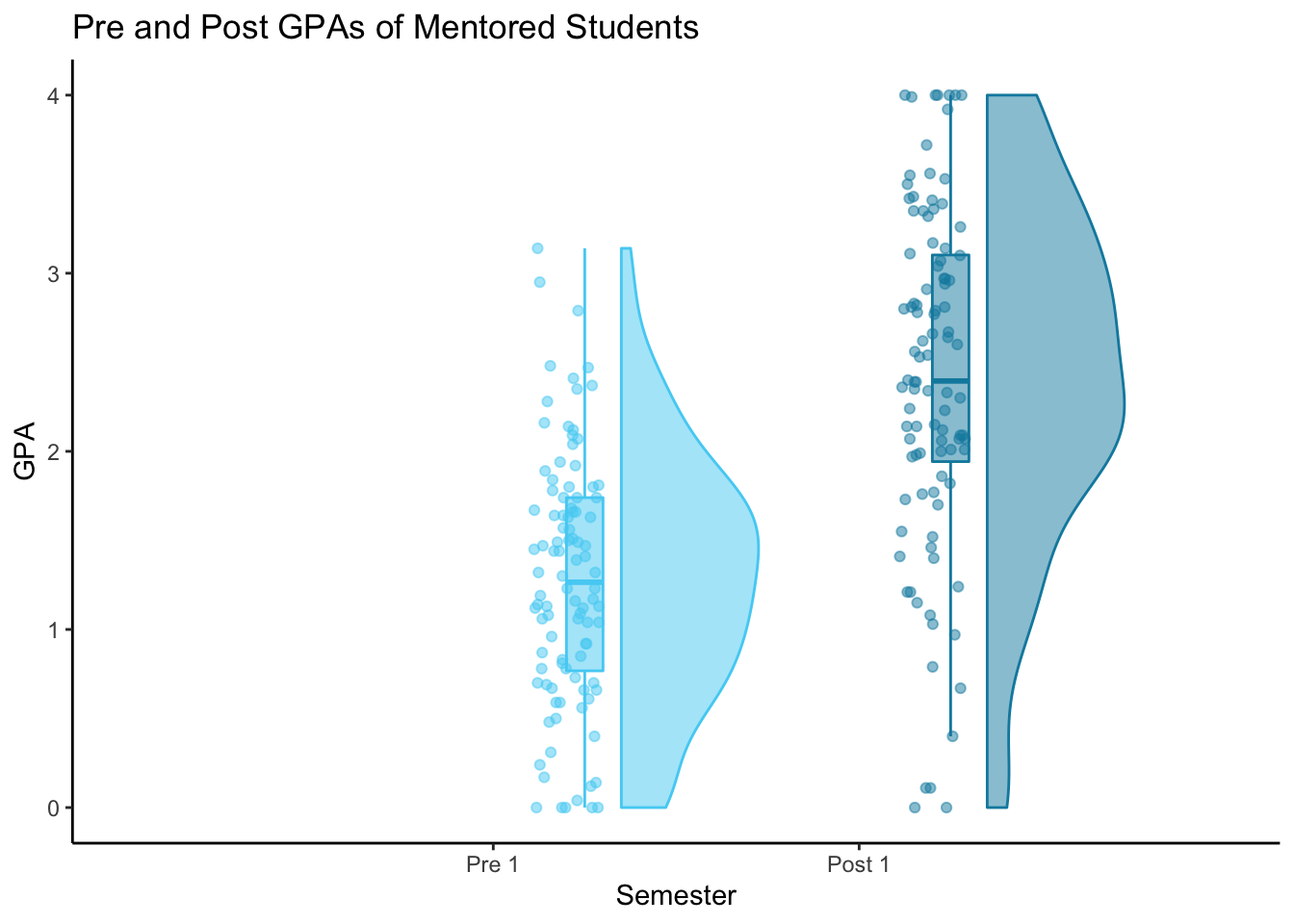
I set the orientation (ort) to ‘v’ so the plots will be vertical instead of horizontal, making time on the x-axis and GPA on the y-axis.
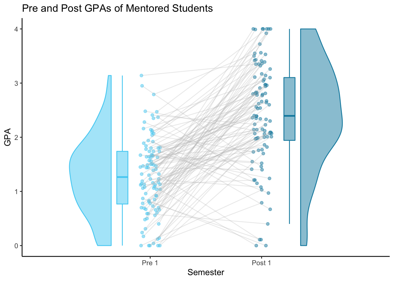
1x1 Comparison for Repeated Measures Using raincloud_1x1_remes()
Because my data includes repeated measurements (GPA measurements for each student over many semesters), I found the raincloud_1x1_remes() plot to be more interesting because it includes lines connected each pair of datapoints.
# Mentored Pre-Post 1x1 raincloud plot - ties
M_pre_post_ties <- raincloud_1x1_repmes(
  data = Mentored_pre_post,
  colors = (c(m_pre, m_post)),
  fills = (c(m_pre, m_post)),
  line_color = 'gray',
  line_alpha = .3,
  size = 1.5,
  alpha = .5,
  align_clouds = FALSE) +
  scale_x_continuous(breaks=c(1,2), labels=c("Pre 1", "Post 1"), limits=c(0, 3)) +
  xlab("Semester") +
  ylab("GPA") +
  labs(title = "Pre and Post GPAs of Mentored Students") +
  theme_classic()
M_pre_post_ties
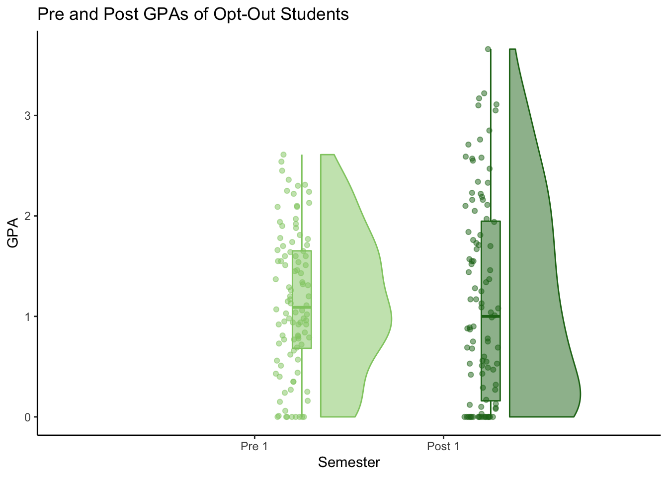
Repeat with Other Group
My next step was to create these same two plots with the Control group.
#Create Control Pre-Post 1x1
Control_pre_post <- data_1x1(
  array_1 = Control$`Pre_1`,
  array_2 = Control$`Post_1`,
  jit_distance = .09,
  jit_seed = 321)

#Control Pre-Post 1x1 raincloud plot - no ties
C_pre_post <- raincloud_1x1(
  data = Control_pre_post,
  colors = (c(c_pre, c_post)),
  fills = (c(c_pre, c_post)),
  size = 1.5,
  alpha = .5,
  ort = 'v') +
  scale_x_continuous(breaks=c(1,2), labels=c("Pre 1", "Post 1"), limits=c(0, 3)) +
  xlab("Semester") +
  ylab("GPA") +
  labs(title = "Pre and Post GPAs of Opt-Out Students") +
  theme_classic()
C_pre_post
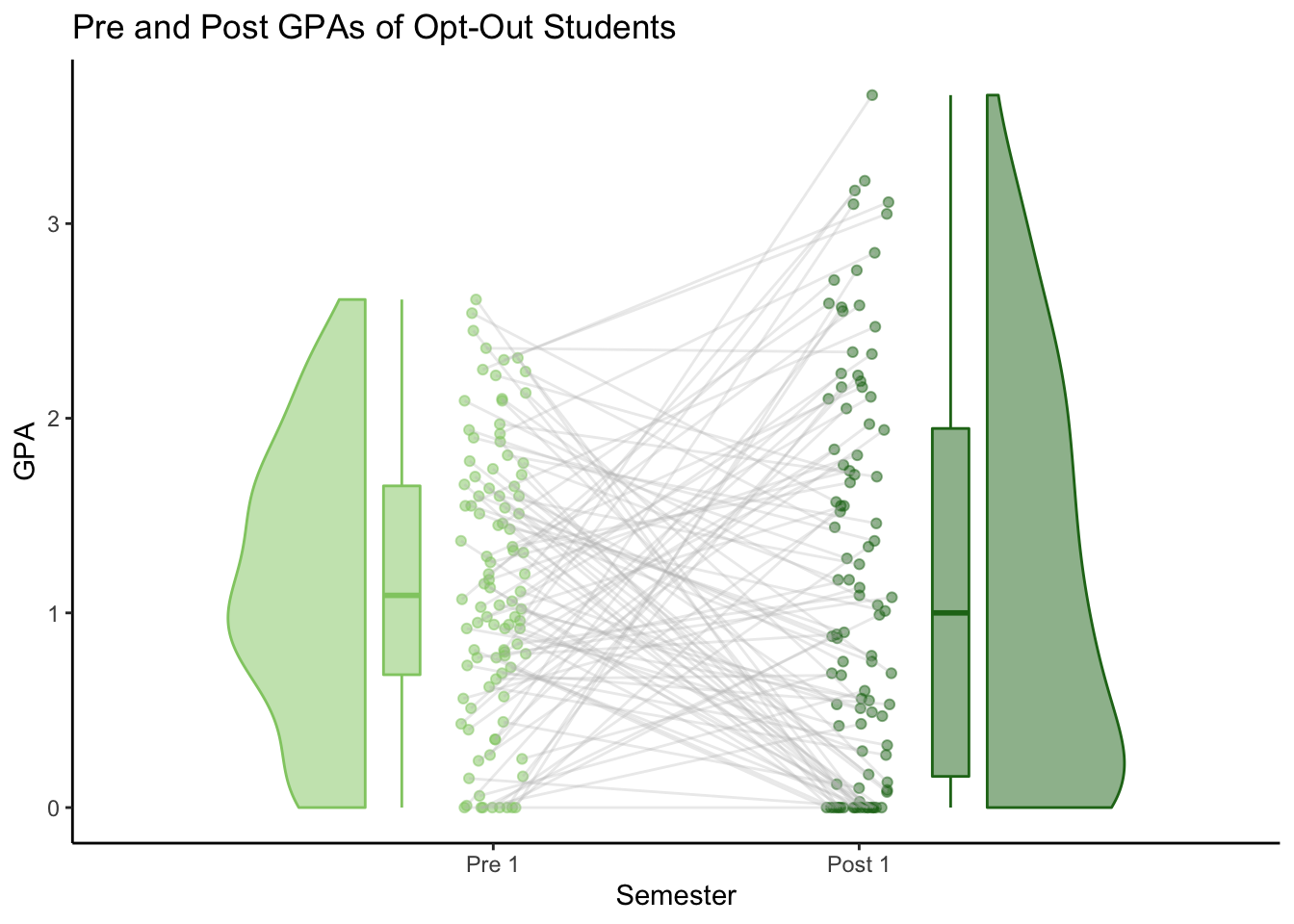
# Control Pre-Post 1x1 raincloud plot - ties
C_pre_post_ties <- raincloud_1x1_repmes(
  data = Control_pre_post,
  colors = (c(c_pre, c_post)),
  fills = (c(c_pre, c_post)),
  line_color = 'gray',
  line_alpha = .3,
  size = 1.5,
  alpha = .5,
  align_clouds = FALSE) +
  scale_x_continuous(breaks=c(1,2), labels=c("Pre 1", "Post 1"), limits=c(0, 3)) +
  xlab("Semester") +
  ylab("GPA") +
  labs(title = "Pre and Post GPAs of Opt-Out Students") +
  theme_classic()
C_pre_post_ties
Here are the the two types of 1x1 plots for each group:
2x2 Comparison for Repeated Measures Using raincloud_2x2_repmes()
What I really want to compare is the GPA change for both groups of students. The 2x2 plot functions came in handy here. The 2x2 functions require a slightly different format of dataframe than the 1x1’s, so I used data_2x2() to create my new dataframe.
#Create 2x2 together dataframe
Both_pre_post_together <- data_2x2(
  array_1 = Mentored$Pre_1, #first set of values - group 1
  array_2 = Control$Pre_1, #first set of values - group 2
  array_3 = Mentored$Post_1, #second set of values - group 1
  array_4 = Control$Post_1, #second set of values - group 2
  labels = (c('Mentored','Control')),
  jit_distance = .09,
  jit_seed = 321,
  spread_x_ticks = FALSE) #We'll be using this data in our not-spread chart
##   y_axis x_axis id    group       jit
## 1   0.66      1  1 Mentored 1.0820609
## 2   1.32      1  2 Mentored 1.0787114
## 3   0.48      1  3 Mentored 0.9528797
## 4   2.48      1  4 Mentored 0.9559133
## 5   1.44      1  5 Mentored 0.9802922
## 6   0.50      1  6 Mentored 0.9714124
##     y_axis x_axis  id   group      jit
## 395   0.00   2.01  95 Control 2.050425
## 396   2.05   2.01  96 Control 1.967888
## 397   0.03   2.01  97 Control 2.059311
## 398   0.51   2.01  98 Control 1.979710
## 399   2.23   2.01  99 Control 1.939180
## 400   0.09   2.01 100 Control 2.072952
The order of your arrays really matters here. They’ll be added into the y-axis column in the order you name them, and this order controls which group (in our case - Mentored or Control) they are assigned to and which x-axis value they are assigned (1.00, 1.01, 2.00, or 2.01). Keep in mind that array_1 and array_3 will get assigned the first group label (“Mentored”), and array_2 and array_4 will get assigned the second group label (“Control”). Like with the 1x1, the arrays are paired, so they should be in the same order and have the same number of rows.
(This took some trial and error for me. I checked that every group was in the correct place by comparing my 2x2 charts side-by side with my 1x1 charts I had made previously.)
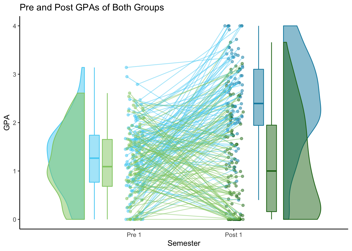
2x2 Spread = FALSE
Both types of 2x2 plots use raincloud_2x2_repmes(). The first type uses only 2 x-axis ticks, so it displays both groups on top of each other.
# 2x2 raincloud plot - together
pre_post_together <- raincloud_2x2_repmes(
  data = Both_pre_post_together,
  colors = c(m_pre, c_pre, m_post, c_post),
  fills = c(m_pre, c_pre, m_post, c_post),
  size = 1.5,
  alpha = .5,
  spread_x_ticks = FALSE) +
  scale_x_continuous(breaks=c(1,2), labels=c("Pre 1", "Post 1"), limits=c(0, 3)) +
  xlab("Semester") +
  ylab("GPA") +
  labs(title = "Pre and Post GPAs of Both Groups") +
  theme_classic()
pre_post_together
2x2 Spread = TRUE
The second type uses 4 x-axis ticks and shows each group side-by-side on the plot. To make this type of 2x2 chart, we need to build our dataframe in a slightly different way. We can still use data_2x2(), but the order of the arrays is different. (Tip: The arrays should always be named in the order that they appear on the chart - left to right). The only other difference is to set spread_x_ticks = TRUE. This changes the x-values to be 1, 2, 3, or 4 based on which array that data came from. The labels still alternate between arrays, so instead of the group name, they should be the semester name (Pre 1 and Post 1). (I don’t think these values are used when building the chart at all, so it doesn’t really matter what they are).
#Create 2x2 spread dataframe
Both_pre_post_spread <- data_2x2(
  array_1 = Mentored$Pre_1, #first set of values - group 1
  array_2 = Mentored$Post_1, #second set of values - group 1
  array_3 = Control$Pre_1, #first set of values - group 2
  array_4 = Control$Post_1, #second set of values - group 2
  labels = (c('Pre 1','Post 1')),
  jit_distance = .09,
  jit_seed = 321,
  spread_x_ticks = TRUE)
##   y_axis x_axis id group       jit
## 1   0.66      1  1 Pre 1 1.0820609
## 2   1.32      1  2 Pre 1 1.0787114
## 3   0.48      1  3 Pre 1 0.9528797
## 4   2.48      1  4 Pre 1 0.9559133
## 5   1.44      1  5 Pre 1 0.9802922
## 6   0.50      1  6 Pre 1 0.9714124
##     y_axis x_axis  id  group      jit
## 395   0.00      4  95 Post 1 4.040425
## 396   2.05      4  96 Post 1 3.957888
## 397   0.03      4  97 Post 1 4.049311
## 398   0.51      4  98 Post 1 3.969710
## 399   2.23      4  99 Post 1 3.929180
## 400   0.09      4 100 Post 1 4.062952
# 2x2 raincloud plot - spread
pre_post_spread <- raincloud_2x2_repmes(
  data = Both_pre_post_spread,
  colors = c(m_pre, m_post, c_pre, c_post),
  fills = c(m_pre, m_post, c_pre, c_post),
  line_color = 'gray',
  line_alpha = .3,
  size = 1.5,
  alpha = .5,
  spread_x_ticks = TRUE) +
  scale_x_continuous(breaks=c(1,2,3,4), labels=c("Pre 1", "Post 1","Pre 1", "Post 1"), limits=c(0, 5)) +
  xlab("Semester") +
  ylab("GPA") +
  labs(title = "Pre and Post GPAs of Both Groups") +
  theme_classic()
pre_post_spread
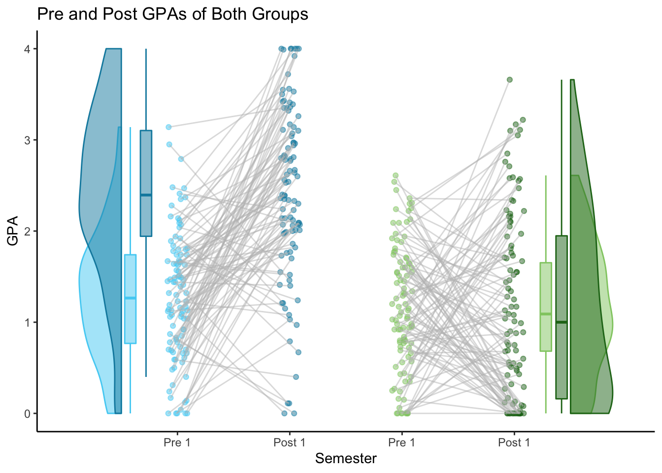
Of the two 2x2 plots, I think I prefer the spread = TRUE version.
Here are all 6 plots I’ve made so far:
gridExtra::grid.arrange(M_pre_post, C_pre_post, M_pre_post_ties, C_pre_post_ties, pre_post_together, pre_post_spread)
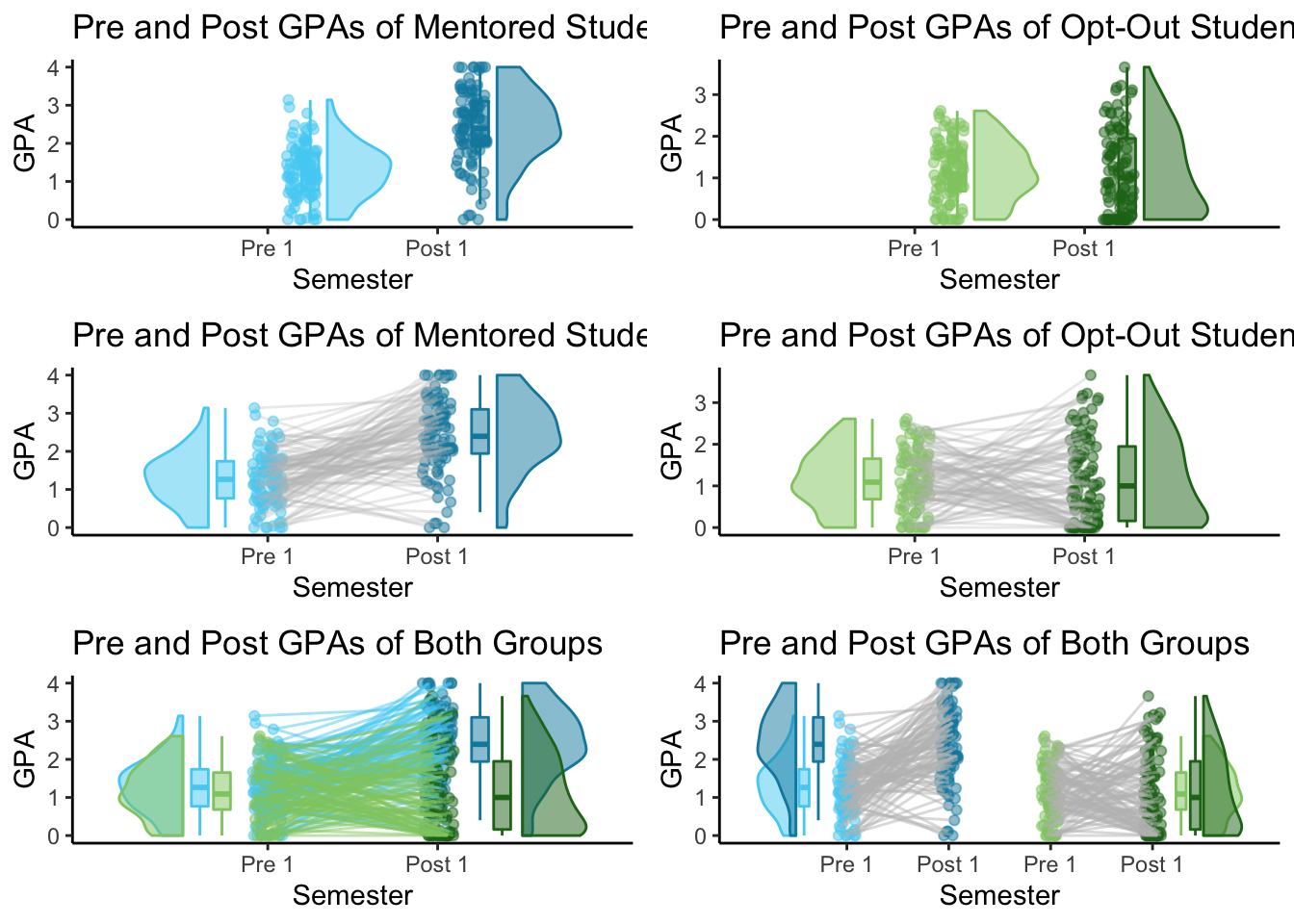 I used this grid to help check that all of arrays were in the right spot. The 2x2 dataframes were a bit tricky to create, so seeing the 2x2 plots next to the 1x1 plots really helped me to see which distribution should belong to which group/color.
Out of these 6 plots, I think my favorite is actually the 1x1 Repeated Measures plot. However, the 2x2 plots are also very interesting. I wouldn’t use the 1x1 grouped plot unless I wanted to compare Mentored and Control students' GPA’s from one specific semester.
2x3 Comparison for Repeated Measures Using raincloud_2x2_repmes()
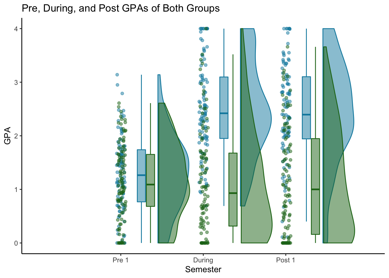
My data actually has 3 time periods instead of two: Pre 1, During, and Post 1. The raincloudplots package has a raincloud_2x3_repmes() function to plot 3 sets of data from 2 groups.
The 2x3 dataframes are created using the same data_2x2() function as 2x2. You just include extra arrays. The 2x3 plot has one x-axis tick for each time period, so the arrays go in the same order as the non-spread 2x2 (Mentored-pre, Control-pre, Mentored-during, Control-during, Mentored-post, Control-post).
#Create 2x3 together dataframe
Both_2x3 <- data_2x2(
  array_1 = Mentored$Pre_1, #first set of values - group 1
  array_2 = Control$Pre_1, #first set of values - group 2
  array_3 = Mentored$During, #second set of values - group 1
  array_4 = Control$During, #second set of values - group 1
  array_5 = Mentored$Post_1, #third set of values - group 1
  array_6 = Control$Post_1, #third set of values - group 2
  labels = (c('Mentored','Control')),
  jit_distance = .05,
  jit_seed = 321)
To build the chart, we’ll use the raincloud_2x3_repmes() function. For this chart, rather than having 3 shades of blue and 3 shades of green, I just use green for the control group and blue for the mentored group.
# 2x2 raincloud plot - together
both_2x3 <- raincloud_2x3_repmes(
  data = Both_2x3,
  colors = c(mentored_col, control_col, m_during, c_during, m_post, c_post),
  fills = c(mentored_col, control_col, m_during, c_during, m_post, c_post),
  size = 1.5,
  alpha = .5) +
  scale_x_continuous(breaks=c(1,2,3), labels=c("Pre 1", "During", "Post 1"), limits=c(0, 4)) +
  xlab("Semester") +
  ylab("GPA") +
  labs(title = "Pre, During, and Post GPAs of Both Groups") +
  theme_classic()
both_2x3
Final thoughts
Overall, the most useful plot for this project is the 1x1 repeated measures plot. Even though it only shows one group, I made a separate plot for each group and displayed them in a grid.
The chart allows me to clearly see the difference in distribution between both semester and treatment group, as well as the ties connected each student’s GPAs from semester to semester.
The raincloudplots package was really helpful in quickly creating these plots. The downside was that my data needed to be in a very specific format, and the plots are hard to customize using normal ggplot functions. I spent a bit of time looking through the source code to understand what was going on so I could get my data in the right format. As I did that, I learned more about how these plots are built and how I could build them myself using ggplot. If I were to make these types of plots on other data (in tidy/long format), or if I wanted to customize them with a legend and other annotations, then I would probably choose to build the plots myself using ggplot. Aside from those cases, I would definitely use raincloudplots again. It’s a quick way to visualize both spread and individual points in data.
Sources
- Allen, M., Poggiali, D., Whitaker, K., Marshall, T. R., van Langen, J., & Kievit, R. A.
    Raincloud plots: a multi-platform tool for robust data visualization [version 2; peer review: 2 approved]
    Wellcome Open Research 2021, 4:63. https://doi.org/10.12688/wellcomeopenres.15191.2