Exploring Data through Visualization
Exploratory Data Analysis - Part 2
I’m currently working on a project with data provided by BYU-Idaho Peer-Success Mentoring. I’ve already wrangled the data into a tidy format to use in my analysis. Next, I will be exploring the data through some visualizations.
In this post, I’ll go through my exploration process, starting with a tidy dataset and creating various plots along the way. I’ll be using using the tidyverse package, specifically ggplot2 for creating graphics.
#load packages
library(tidyverse) #includes dplyr, ggplot2, and other packages that are in the tidyverse core
Project Background
BYU-Idaho Peer-Success Mentoring provides short-term mentoring to a variety of BYU-Idaho student populations with a goal to improve student success and retention. We’re interested in looking for possible correlation between participation in mentoring and defined measures of student success, including improved GPA.
The project will be focused on answering the following question: Do students who participate in Peer-Success Mentoring have more success (improvement in GPA) than students who don’t participate in Peer-Success Mentoring?
This question will be explored through various forms of data analysis, hypothesis testing, and inferential statistics, using data about students who met defined mentoring criteria. A Control group of students who met the criteria but did not participate in mentoring will be compared with a Mentored group of students who met the same criteria and did participate in mentoring. Click here to read more about Peer-Success Mentoring and the background for this project.
Compare 2 groups (Mentored vs Control)
First I want to explore the two main groups of students: mentored and control.
Color Code the Data
I want to distinguish between the two groups pretty easily on my plots, so I will be using a color for each group. Rather than use the default ggplot2 colors, I chose to use the mentoring program’s color for the Mentored group, and a contrasting color for the Control group. I’m defining them now so I can easily referencing them later on.
#Define colors
mentored_col = '#0B8AAD'
control_col = "#21731B"

#Mentored Group Colors
m_pre = "#52D1F4"
m_during = '#0B8AAD'
m_post = '#0B8AAD'

#Control Group Colors
c_pre = "#90cb71"
c_during = "#21731B"
c_post = "#21731B"
Distribution
One of the first steps I usually take when exploring new data is to look at the distribution of the target variable(s). In this case, our targets are the GPA values in four different semesters. A histogram can show how the GPA values are distributed among the students in each group for each semester.
Students_long %>%

  ggplot(aes(x = GPA,
             fill = Group)) +

  geom_histogram(color = "white", binwidth = 0.25, boundary = 0) +

  geom_vline(xintercept = 2.0, alpha = .8) +

  facet_grid(rows = vars(Group), cols = vars(semester), scales = "fixed") +

  labs(title = "Distribution of GPAs Over 4 Semesters for Each Group",
       #subtitle = "",
       x = "Semester GPA / 4.0",
       y = "# of observations") +

  scale_fill_manual(values=c(c_post, m_post)) +

  theme_bw() +

  theme(legend.position = "none",
        strip.background = element_rect(fill = "white"),
        strip.text.y = element_text(angle = 0, hjust = 0))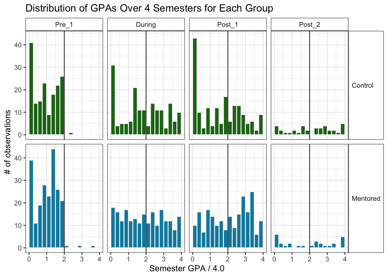
It looks like in both groups, the histogram is clustered around the lower GPA end for Pre_1, with most of the data below 2.0. This makes sense because part of the Tier 3 criteria for mentoring is having a semester GPA below 2.0. Some students could have had a semester GPA above 2.0 and still met Tier 3 criteria due to their cumulative GPA or other factors, or they could have been referred to the program and did not meet Tier 3 criteria.
After Pre_1, both groups spreads out to cover more GPA values above 2.0. This stark change in spread surprised me. Maybe the non-improving students became discouraged and dropped out, leaving mostly students who did improve their GPA. I want to check how many students are in each group for all the semesters to see if that’s what happened.
Value Counts
To see the number of GPA measurements in each group for each semester, I used the group_by() and summarise() functions. I then piped those summaries into my ggplot and used geom_col() to make a vertical bar chart.
Students_long %>%
  na.omit() %>%
  group_by(Group, semester, semester_mentored) %>%
  summarise(num = n()) %>%


  ggplot(aes(x = semester,
             y = num,
             color = Group,
             fill = Group,
             label = num)) +

  geom_col(color = NA) +

  facet_grid(cols = vars(Group), rows = vars(semester_mentored), scales = "fixed") +

  labs(title = "",
       y = "Number Students who Completed that Semester",
       x = "Semester in Relation to the Semester Offered Mentoring") +

  geom_text(nudge_y = 6) +

  scale_fill_manual(values=c(c_post, m_post)) +

  scale_color_manual(values=c(c_post, m_post)) +

  theme_bw() +

  theme(legend.position = "none",
        axis.text.x = element_text(angle = 90),
        strip.background = element_rect(fill = "white"),
        strip.text.y = element_text(angle = 0))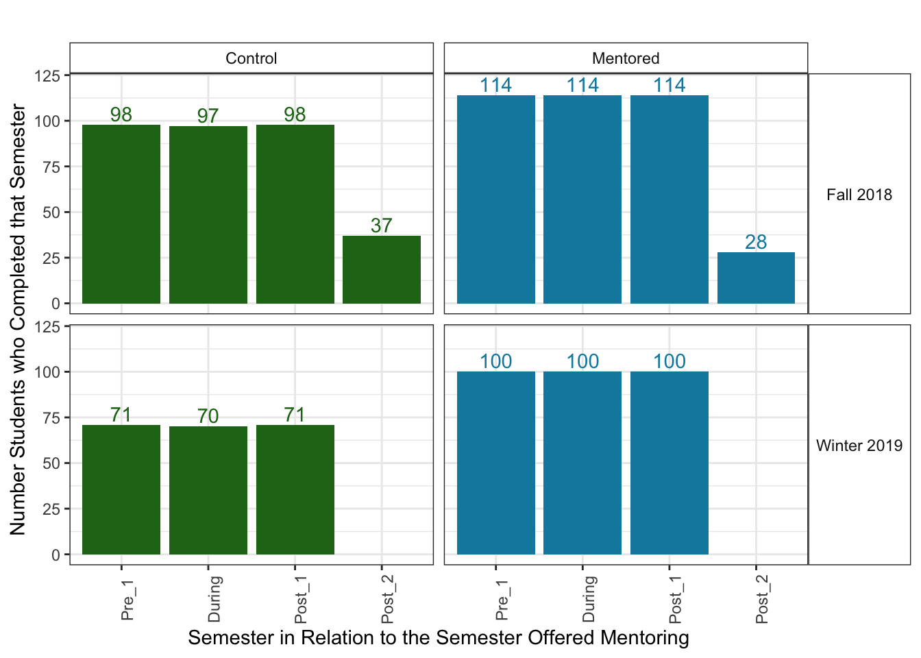
This is odd. It looks as if all of these students attended 3 semesters in a row, and then many left school in the 4th semester.
At first I thought this might be due to BYU-Idaho’s 3-track system, where students are assigned 2 out of the 3 semesters per year. That means that most students attend two semesters in a row and then skip a semester. However, not every student attends the same 2 semesters in a row.
It would make sense that students attended both the first two semesters. They needed to attend and complete Pre_1 to meet the criteria to be offered mentoring. I wouldn’t be surprised though if many students from the Control group did not attend or complete the During semester. I’m actually a bit surprised that every single Attempted student attended the During Semester and Post_1.
It could be that this data was not collected in the way I initially thought. After some discussion with the mentoring program, I found out that this was the case.
Understanding the Data Collection Process
It turns out that this data only includes students that had attended at least 1 additional semester after mentoring, and it only includes GPA’s from the semesters that the student attended. So if a student skipped the semester right after mentoring but returned the following semester, then that semester’s GPA was recorded for Post_1 instead of Post_2.
This dataset was created between Spring 2019 and Fall 2019. This means that the only semesters included are Spring 2018, Fall 2018, Winter 2019, and Spring 2019. For students who were offered mentoring in Winter 2019, there is only data for their Post_1 semester, which is Spring 2019. For students who were offered mentoring in Fall 2018, their Post_1 semester could have been Winter 2019 or Spring 2019 (some students might have been off-track or deferred in Winter 2019). Their Post_2 semester could be Spring 2019 if they attended Winter 2019 and Spring 2019, but many of them do not have a Post_2 GPA due to either skipping Winter 2019 or skipping Spring 2019.
Because most students did not attend the Post_2 semester, I do not want to include it in this analysis. It would be interesting to use for further analysis after collecting more data.
Students_wide <- Students_wide %>%
  select(-("Post_2"))

Students_long <- Students_long %>%
  filter(semester != "Post_2")
This sample of students may not be representative of all Tier 3 students, so I will need to make sure I keep the data collection process in mind later on when I test hypotheses about the data.
Diving Deeper
Now that we understand the basics of the data a bit more, let’s look more into different values.
A box-and-whiskers plot is helpful to see where the four quartiles of the data lie. I used geom_boxplot and mapped x to “semester” and fill to “Group” to plot multiple boxplots in one chart. That way, I can compare the median and other values across all the boxplots.
#look at GPA distribution of both groups over 3 semesters
Students_long %>%

  ggplot(mapping = aes(x = semester,
                       y = GPA,
                       fill = Group)) +

  geom_boxplot(alpha = .8) +

  scale_fill_manual(values=c(c_post, m_post)) +

  scale_color_manual(values=c(c_post, m_post)) +

  labs(title = "GPA Distributions for Each Group Across 3 Semesters") +

  theme_minimal() +
  theme(legend.position = "bottom")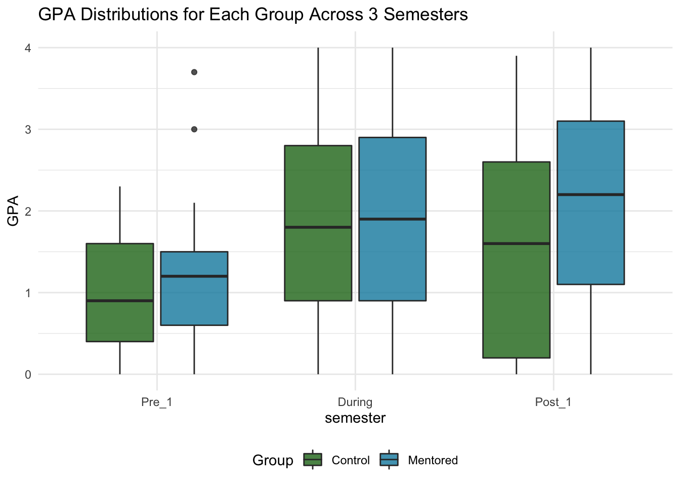
For both groups, over 75% of the students had GPA’s below 2.0 during Pre_1, while only ~50% of the students had GPA’s below 2.0 in During. In Post_1, the Control group shifted back down - around 75% of students had a GPA below 2.5. The Mentored group, however, shifted up. Over half of the Mentored Students had a GPA above 2.0, and 25% of them had a GPA above 3.0.
Individual Points
I’d like to look more at the individual points next. I’ll create a strip plot using geom_jitter() instead of geom_point().
#Strip plot of GPAs for two groups across 3 semesters

ggplot(data = Students_long, mapping = aes(x = Group, y = GPA, col = Group)) +

  geom_jitter(width = .3, height = 0.01, alpha = .8) +

  facet_wrap(facets = ~semester, nrow = 1) +

  labs(title = "GPA Distributions for Each Group Across 3 Semesters", x = "") +

  scale_color_manual(values=c(c_post, m_post)) +

  theme_bw() +

  theme(legend.position = "bottom",
        strip.background = element_rect(fill = "white",
                                        color = "white"))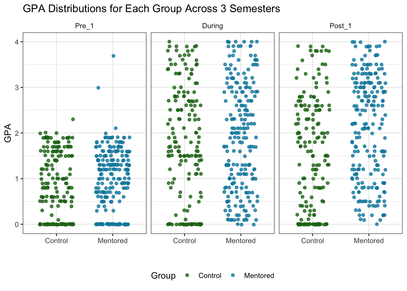
A lot of the points are on 0 for all of the semesters. Like we saw in the boxplots, most of the Pre_1 GPA’s for both groups are below 2.0, and the GPA’s are evenly split above and below 2.0 for the later semesters.
Putting it together
If we put the points and the boxplots together, we can see each point in context with the 4 quartiles.
#look at GPA distribution of both groups over 3 semesters

Students_long %>%

  ggplot(mapping = aes(x = semester,
                       y = GPA,
                       fill = Group,
                       color = Group)) +

  geom_boxplot(alpha = .2, color = "black") +

  geom_jitter(width = .3, height = 0, alpha = .7, size = .85) +

  facet_wrap(facets = ~Group_size_label, nrow=1) +

  scale_fill_manual(values=c(c_post, m_post)) +

  scale_color_manual(values=c(c_post, m_post)) +

  labs(title = "GPA Distributions for Each Group Across 3 Semesters") +

  theme_minimal() +

  theme(legend.position = "none")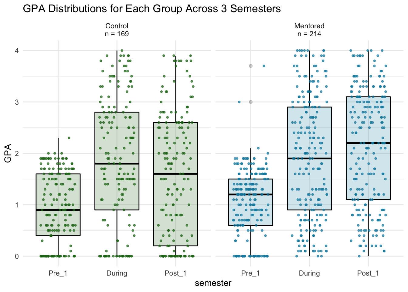
Change in GPA
While the above plots give us some insight into the data, we’re wanting to know about GPA change on an individual level. How did each student’s GPA change from Pre_1 to Post_1?
First look
The following plots show the ties between each students’ Pre and Post GPA’s, along with the distribution of all Pre and all Post GPAs. I used libary(raincloudplots) to create these. (See more details and a walkthrough in this post. )
library(raincloudplots)

# Create Mentored Pre-Post 1x1
Mentored_pre_post <- data_1x1(
  array_1 = Mentored$`Pre 1`, #first set of values
  array_2 = Mentored$`Post 1`, #second set of values
  jit_distance = .09,
  jit_seed = 321)
# Mentored Pre-Post 1x1 raincloud plot - ties
M_pre_post_ties <- raincloud_1x1_repmes(
  data = Mentored_pre_post,
  colors = (c(m_pre, m_post)),
  fills = (c(m_pre, m_post)),
  line_color = 'gray',
  line_alpha = .3,
  size = 1.5,
  alpha = .5,
  align_clouds = FALSE) +
  scale_x_continuous(breaks=c(1,2), labels=c("Pre 1", "Post 1"), limits=c(0, 3)) +
  xlab("Semester") +
  ylab("GPA") +
  labs(title = "Pre and Post GPAs of Mentored Students") +
  theme_classic()


# Create Control Pre-Post 1x1
Control_pre_post <- data_1x1(
  array_1 = Control$`Pre 1`, #first set of values
  array_2 = Control$`Post 1`, #second set of values
  jit_distance = .09,
  jit_seed = 321)
# Control Pre-Post 1x1 raincloud plot - ties
C_pre_post_ties <- raincloud_1x1_repmes(
  data = Control_pre_post,
  colors = (c(c_pre, c_post)),
  fills = (c(c_pre, c_post)),
  line_color = 'gray',
  line_alpha = .3,
  size = 1.5,
  alpha = .5,
  align_clouds = FALSE) +
  scale_x_continuous(breaks=c(1,2), labels=c("Pre 1", "Post 1"), limits=c(0, 3)) +
  xlab("Semester") +
  ylab("GPA") +
  labs(title = "Pre and Post GPAs of Control Students") +
  theme_classic()

M_pre_post_ties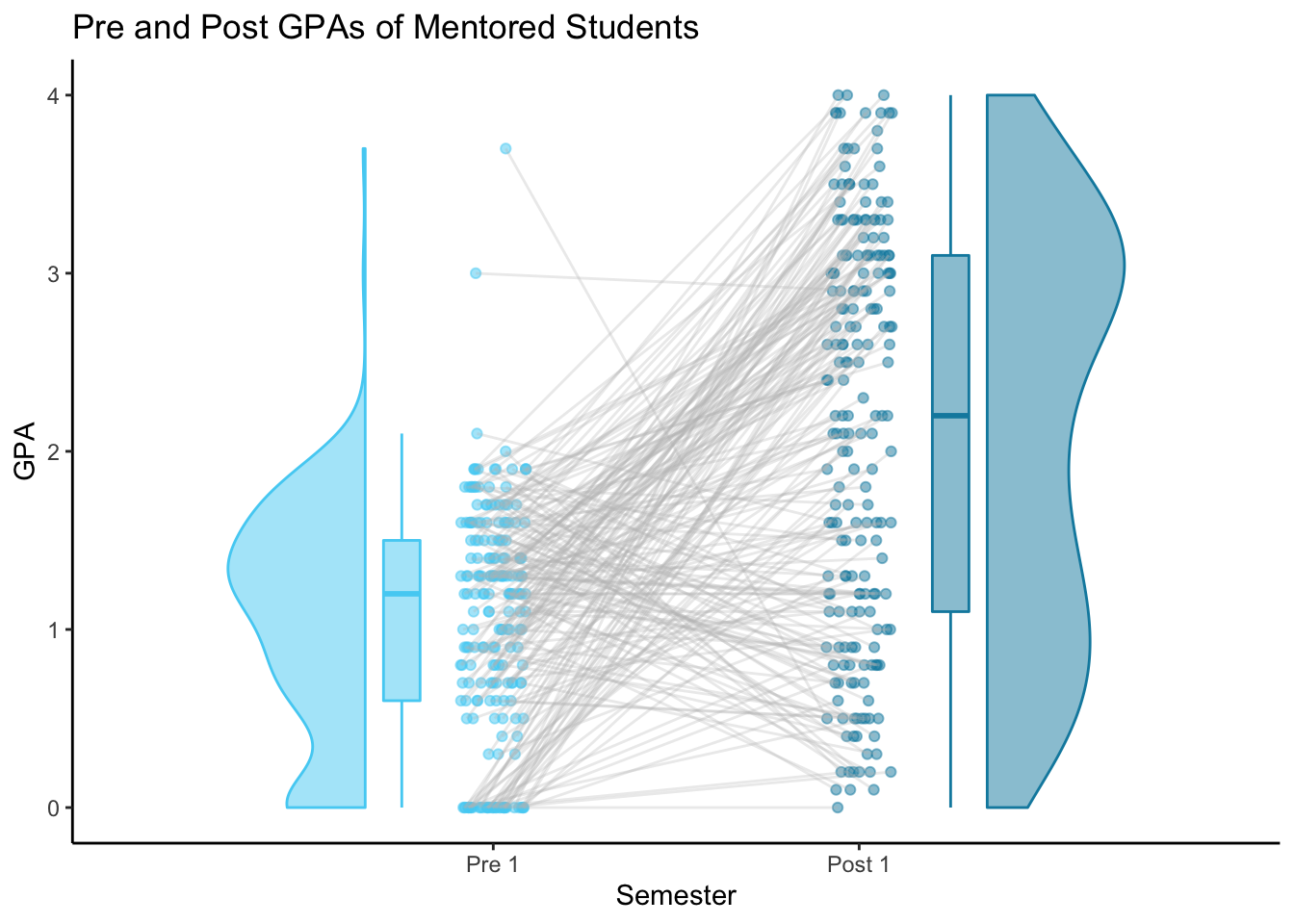
C_pre_post_ties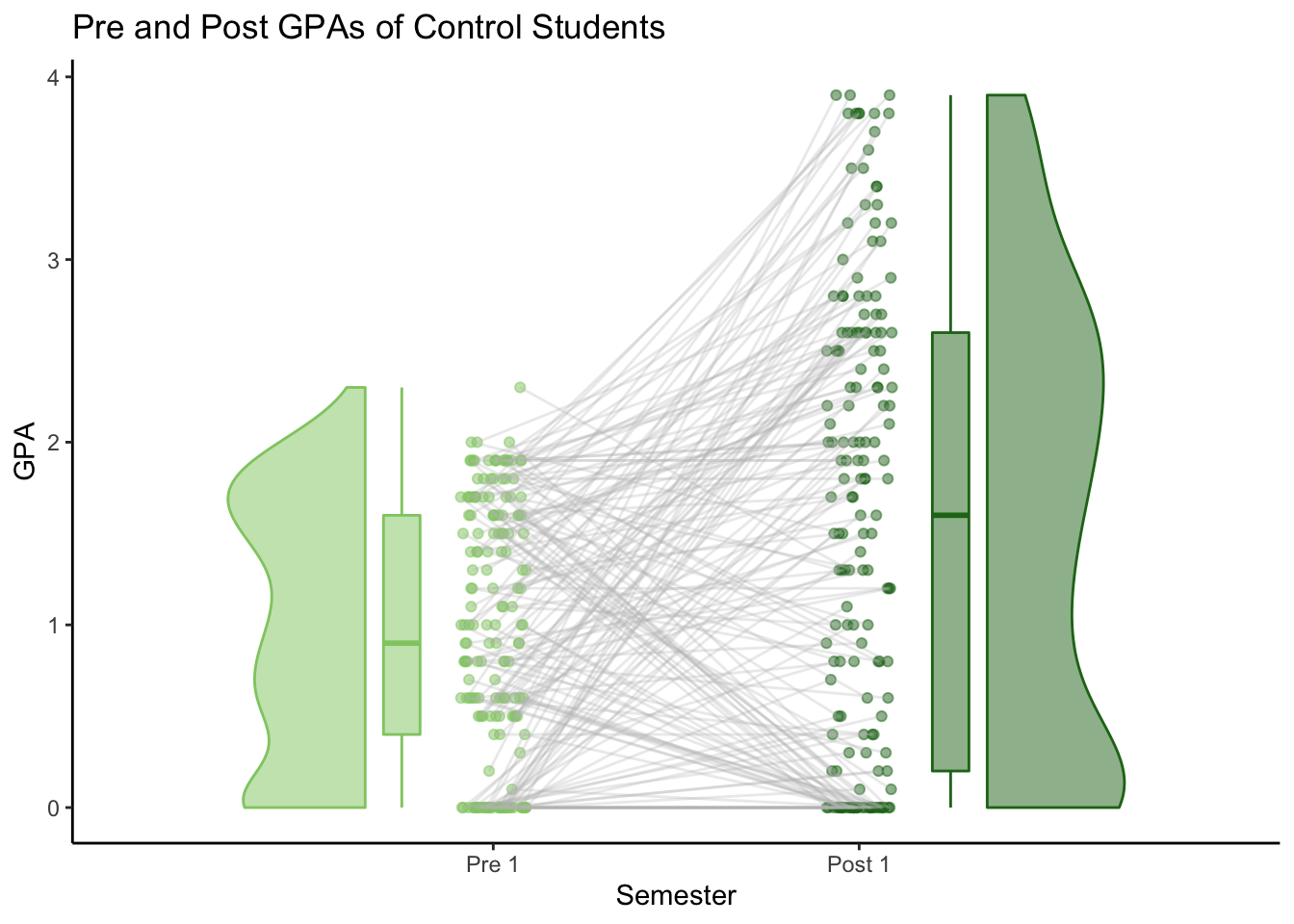
Change from Pre_1 to Post_1
After calculating the change in GPA from Pre_1 to Post_1 for each student, we can compare the changes for both groups.
library(see) #for geom_violinhalf

Students_wide %>%

  ggplot(mapping = aes(x = Group_size_label,
                       y = Change,
                       fill = Group,
                       color = Group
                       )) +

  geom_violinhalf(alpha = .5,
                  color = "black",
                  position = position_nudge(x = .25, y = 0)) +

  geom_boxplot(alpha = .2,
               color = "black",
               width = 0.4) +

  geom_jitter(height = 0,
              size = .85,
              width = .2) +

  geom_abline(slope = 0,
              intercept = 0,
              color = "red",
              lty = 2) +

  labs(title = "Change in GPA from Pre 1 to Post 1",
       x = "",
       y = "Change in GPA") +

  scale_fill_manual(values=c(c_post, m_post)) +

  scale_color_manual(values=c(c_post, m_post)) +

  theme_minimal() +

  theme(legend.position = "none",
        axis.text.x = element_text(size = 15))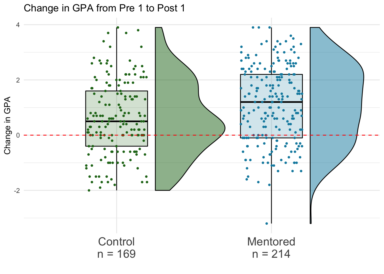
According to the plot, most of the students in the dataset improved their GPAs from Pre 1 to Post 1.
For the Control group, 25% of the students showed large improvement of ~1.6 points or more. 25% of students’ improvement was between ~0.5 points and ~1.6 points. 25% of the students had minimal change in GPA (increased or decreased by ~0.5 points or less). The last 25% of students showed a decrease in GPA from the Pre 1 semester to the Post 2 semester.
For the Mentored group, almost 75% of the students improved. 25% of the students showed large improvement of ~2.1 points or more. 25% of students’ improvement was between ~1.2 points and ~2.1 points. 25% of the students improved by ~1.2 points or less. The last 25% of students showed a decrease in GPA from the Pre 1 semester to the Post 2 semester.
Students_wide %>%
  group_by(Group) %>%
  summarise(`Mean Change` = mean(Change),
            `Median Change` = median(Change),
            `Max Change` = max(Change),
            `Min Change` = min((Change)),
            `Count` = n()) %>%
knitr::kable("markdown")| Group | Mean Change | Median Change | Max Change | Min Change | Count |
|---|---|---|---|---|---|
| Control | 0.600000 | 0.5 | 3.9 | -2.0 | 169 |
| Mentored | 1.099533 | 1.2 | 3.9 | -3.2 | 214 |
Both the mean and the median change in the Mentored group are a good amount higher than the mean and median change in the Control group.
Next Steps
The next step will be to run some hypothesis tests to see if there is a significant difference between these two groups.
Further analysis will include exploring the different Status groups and possibly running hypothesis tests on those, as well as exploring the success of Referral students vs Tier 3 students.
Check out the rest of my work on this project here.